Why We Need The Value Scale To Create Beautiful Color In A Lino Print
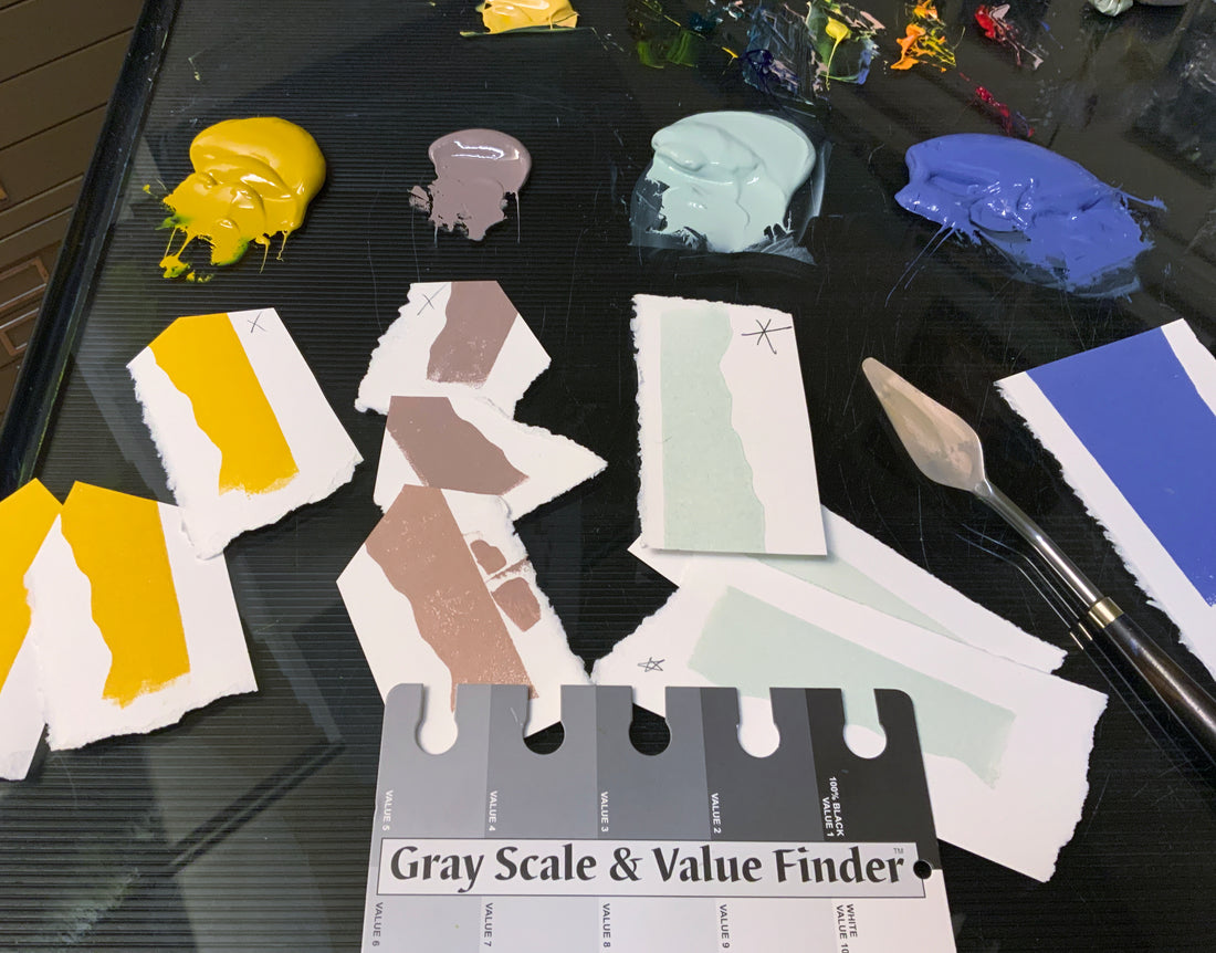
In the excitement to begin our linoprint we're tempted to mix a color quickly and get the thrill of the first impression out of the way. But when creating multi-colored works, the colors mixed are equally as important as the value, or tone, they create. It turns out that beautiful, harmonious colors don't come out of a tin or a tube, but are mixed using black, white, any selection of the three primary colors (red, blue and yellow), and/or any of the individual pigmented inks. All colors become beautiful in relation to adjacent colors. A multi-colored print is best approached with a value plan that allows the colors to work together, to scintillate, contrast and generate excitement, while creating a composition that holds everything together. When I mix color, I test it by printing it on a small piece of the same paper I will use in the edition. Often I test one color several times between modifications. To judge the value, or darkness, I use a gray scale as shown above, available at any art supply store. It allows me to adhere to my value plan as the print progresses from one block to the next. In this case, value 3 will be doing the lion's share of the work. Comparing color to a gray shade can be difficult, but squinting helps. In the next photo you can see how my mixed violet-blue is darker than value 4 and lighter than value 2.


Converted to black and white, the photo shows virtually the same gray at value 3. Keep your value plan simple. It's amazing what can be done with only three values. Working with a value plan will make your work more picturesque and tranquil so that the beauty of the color and the quality of the idea may be absorbed by the viewer's eye. As the old saying goes, value does the work and color gets the glory!