craigmitchellart
Tahoe Dusk
Tahoe Dusk
Couldn't load pickup availability
Evening Silhouettes
A few years ago, I began exploring sunrises and sunsets because I had always believed they were meant to be seen, not painted. I wanted to understand why I felt that way — and whether it was actually true.
When traveling to make color sketches in nature, I began each day and ended each evening by trying to capture those brief moments of extreme color whenever I could. Like many people, I had photographed beautiful sunsets only to look at the photograph later and wonder why it seemed so different from what I had experienced in person.
What the Camera Misses
To understand that difference, I began exploring how human vision compares with the limitations of a camera.
A camera has difficulty capturing the full range of tones we perceive between deep shadow and brilliant light. With a sunset, exposing for the intense colors in the sky can cause the darker areas to become completely black, eliminating detail that our eyes can still perceive.
Our eyes work differently. Rods are primarily sensitive to light and dark, while cones allow us to perceive color. Working together, they give us the ability to perceive a remarkable range of color and tonal information simultaneously.
Over several years of study and experimentation, I came to understand that a sunset can indeed be interpreted with paint, or with a medium such as linoleum block printing. The darker areas need to remain slightly open so that detail survives, while the colors need to be harmonized by a common underlying tone.
The Interaction of Opposites
There's another phenomenon that makes Tahoe Dusk particularly effective. When opposing colors such as blue and orange meet along an edge, they can appear to intensify one another. This is known as simultaneous contrast, a principle explored extensively by the French Impressionists. The same relationship is connected to complementary afterimages, the familiar effect of seeing the opposite color after staring at a strong color for a period of time.
Once I learned to use this principle intentionally, I felt that my work changed for the better. Today, I find it difficult to make art without considering the interaction of opposites.
From Study to Print
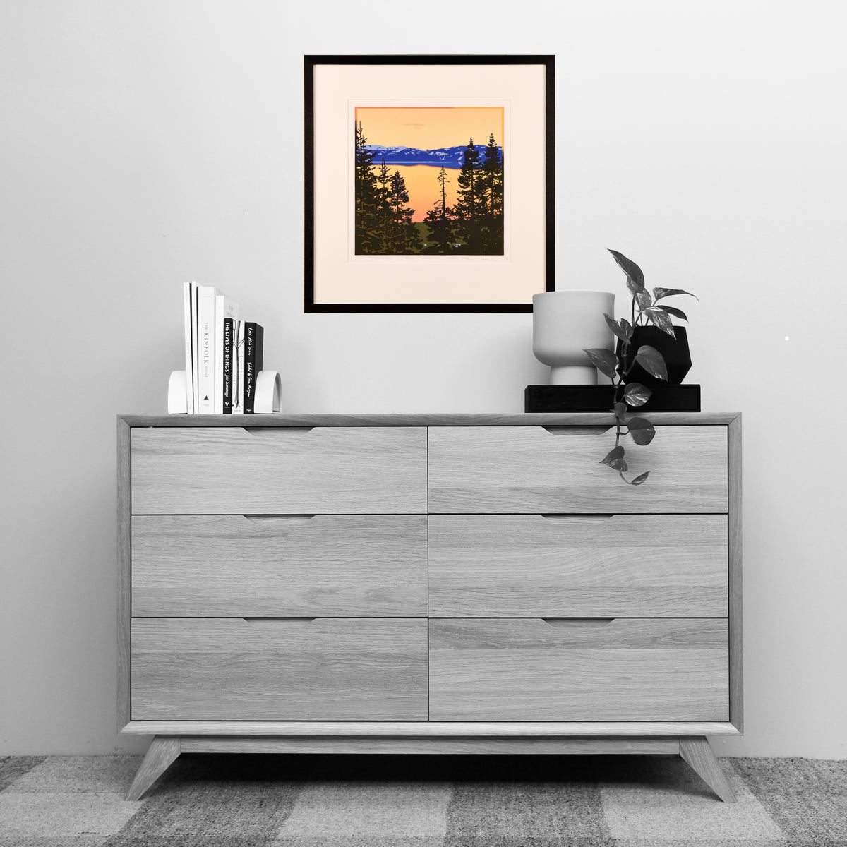
Tahoe Dusk grew out of that exploration. A blue, snowcapped mountain sits beneath a yellow-orange sky, which is reflected across the lake. Pines in the foreground are silhouetted against the light, with small areas of detail intentionally left open within the dark forms.
What This Print Taught Me
I started out trying to prove that a sunset shouldn't be painted. I ended up learning how to paint one, and how to carve one. The answer wasn't in copying the sky more faithfully than a camera could. It was in understanding how we actually see: keeping the darks alive, tying the colors together, and letting blue and orange do what they naturally do to each other along an edge. That lesson now shows up in nearly everything I make.
The print is made from five hand-carved linoleum blocks, each designed, carved, inked, and printed by Craig Mitchell. It is printed on 100% cotton Rives BFK paper, made in France by the Arches Paper Mill and prized by printmakers for its permanence and exceptional surface.
Each print is conservation framed under glass with hand-rubbed ebony walnut molding and is ready to ship within 24 hours.
Edition: 100
Image size: 12" × 12", with a generous margin
Framed size: 20 1/8" W × 20 3/4" H
Materials
Materials
Printed on 100% cotton paper. Framed using conservation-grade materials with regular glass. Ebonized-walnut, hand-made moulding from Picture Woods.
Shipping & Returns
Shipping & Returns
Shipping is based on product weight and materials used. Returns are accepted after approval.